When I decided to renovate my kitchen in Orleans, I knew one thing for certain: the cabinets and countertops had to match perfectly. Not just “good enough,” not “close enough,” but seamlessly, intentionally, and professionally matched. I’ve seen far too many kitchens where the cabinets look like they were chosen during one decade and the countertops in another. I didn’t want contrast that clashed, colours that fought each other, or textures that felt disconnected. I wanted a modern, cohesive, high-end look that flowed naturally from top to bottom.
What I didn’t expect, however, was how complicated this process could be. Matching cabinets and countertops is not just about picking two things you like. It’s about balancing undertones, textures, finishes, lighting, room size, and the overall style of the home. It’s about understanding how quartz interacts with different cabinetry finishes. It’s about knowing how natural light in Orleans homes affects colour perception. And it’s about making technical decisions that dramatically influence the final aesthetic.
Through a lot of research, planning, and hands-on experimentation, I learned the details that truly matter. This is exactly how I matched my kitchen cabinets and countertops perfectly — and how you can avoid the mistakes that homeowners often make during kitchen renovations in Orleans and across Ottawa.
Why Matching Cabinets and Countertops Is More Complicated Than It Looks
The Challenge of Undertones: What I Didn’t Know at First
One of the biggest things I learned early on is that cabinets and countertops don’t just need to match — their undertones need to match. Undertones are the subtle colours hidden beneath the surface appearance.
For example:
- A white quartz countertop may have cool blue undertones
- A cream cabinet finish may have warm yellow undertones
- A grey cabinet may have a green undertone you don’t notice until it’s installed
Put those together, and the mismatch becomes obvious and distracting.
Before renovating, I assumed “white goes with white” or “grey goes with grey.” But the truth is that undertones can make or break a kitchen design.
How Lighting in Orleans Homes Changes the Colour of Materials
Orleans homes get a unique mix of natural light depending on the neighbourhood and the orientation of the house. Some kitchens get bright morning light. Others get softer afternoon lighting. Some get very little natural light at all.
Lighting changes how quartz looks. It changes how cabinet finishes look. It even changes how shadows fall across cabinet panels. Once I realized this, I stopped relying on showroom lighting and started testing my samples inside my own kitchen.
Why Cabinets and Countertops Must Match the Architecture of the Home
I live in Orleans, where many homes have transitional or modern-traditional architecture. That meant I needed to choose cabinet and countertop combinations that complemented the overall structure, not fought against it.
The more I studied my home, the clearer it became that the kitchen needed to feel like an extension of the rest of the house — not a completely different design direction.
My Process for Finding the Perfect Cabinet and Countertop Match
Step 1: Choosing the Right Quartz Countertop First
For some people, cabinets come first. But for me, the countertop decision was the foundation of the entire renovation. Quartz is a major visual anchor in any kitchen, and I wanted a surface that was durable, timeless, and easy to match.
Quartz gave me consistency, a clean surface, and a predictably elegant look.
I looked at dozens of samples but eventually narrowed it down based on:
- Light reflection
- Veining style
- Neutral tone
- Long-term versatility
Once I chose the quartz, everything else became easier — because the countertop served as the guiding element for the rest of the design.
Step 2: Identifying the True Undertone of the Quartz I Chose
Quartz may look white, grey, or beige at first glance, but the undertone tells the truth. I studied my quartz under natural daylight, under warm evening lighting, and under my kitchen’s LED lighting.
I discovered my chosen slab had a neutral-grey undertone with subtle warmth, which meant I needed cabinets that carried the same neutral warmth — not something too cool, not something too yellow.
This discovery saved me from major mistakes later.
Step 3: Bringing Cabinet Samples Into My Kitchen (Not Just the Store)
Cabinet showrooms make everything look beautiful, but lighting there is controlled and unrealistic. Colours shift dramatically when viewed in a real home.
So I brought home:
- Door samples
- Finish swatches
- Paint chips
- Hardware samples
And I tested them all against my quartz sample inside my actual Orleans kitchen, at different times of day.
That’s when I learned how different cabinet whites can be. Some looked too creamy. Some looked dull. Some were blue-white. Some were sterile. None of those would have worked with my quartz’s undertone.
Step 4: Testing Cabinets and Countertops Together Under Real Lighting
The natural lighting in Orleans homes is dynamic. In my kitchen, the morning light was cool and the evening light was warm. I needed a cabinet–countertop match that looked good in both.
So I kept the samples in my kitchen for three days and watched how they changed. This step was critical — it eliminated every combination that only looked good during one time of day.
Step 5: Finalizing the Cabinet Finish That Complemented My Quartz Perfectly
Once I narrowed down my quartz slab and the undertone that worked, I chose cabinets that aligned with it.
The winning cabinet finish had:
- A soft matte texture
- A neutral warm undertone
- A subtle modern line
- A timeless, non-trendy colour
This allowed the quartz to stand out, while the cabinets framed the space elegantly.
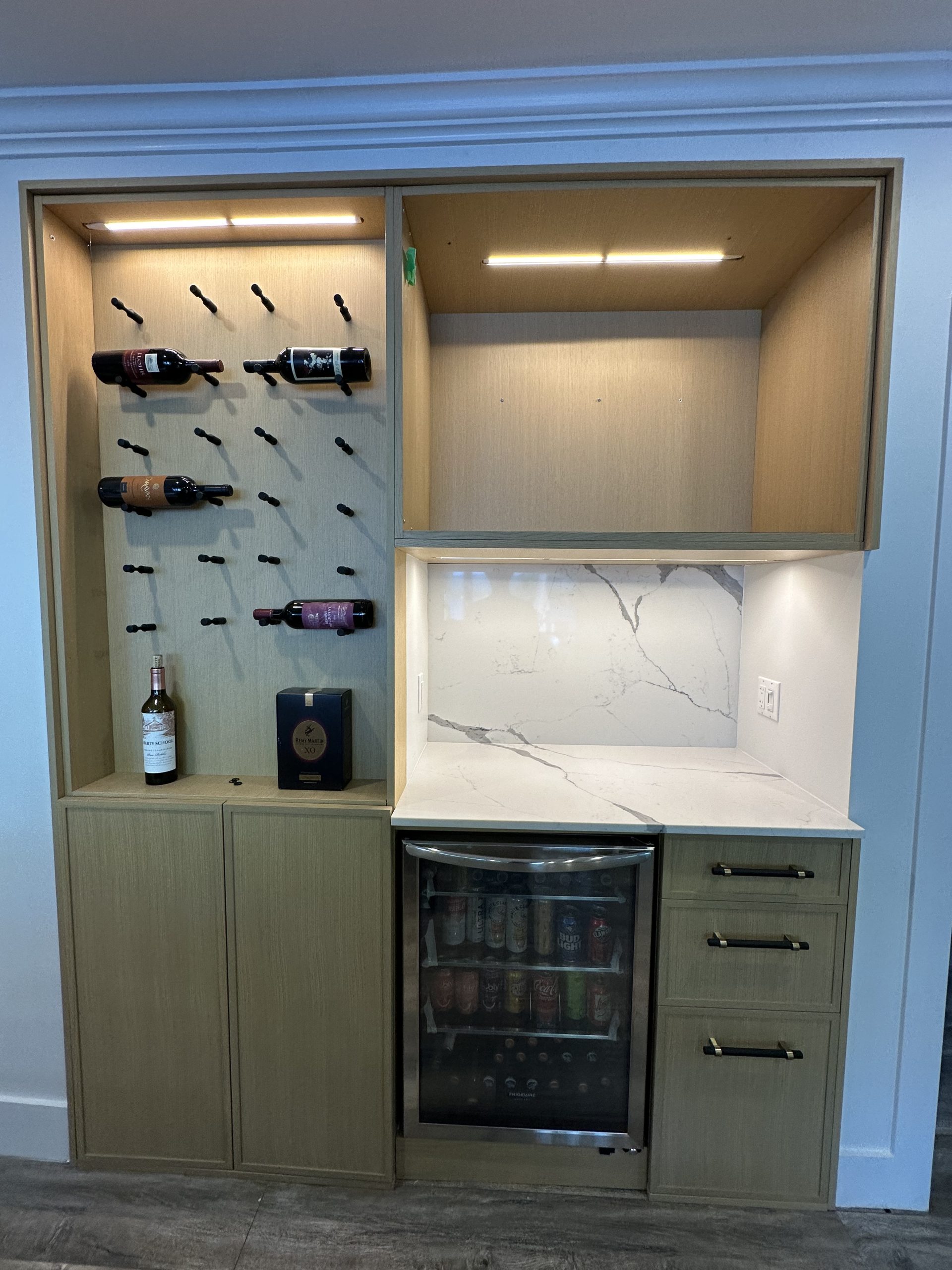
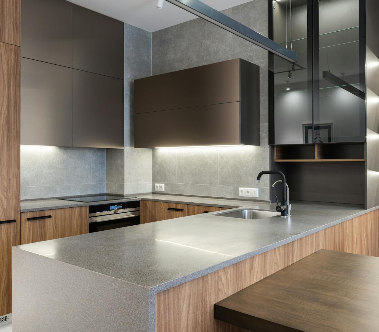
How I Matched Textures, Not Just Colours
Smooth Quartz + Matte Cabinetry = A Perfect Balance
Modern quartz has a smooth, polished surface that reflects light beautifully. To balance this, I chose cabinets with a matte finish. This kept the kitchen from looking overly glossy or artificial.
The contrast between the sleek quartz and the soft cabinet finish created a professional, high-end look that still felt warm and welcoming in my Orleans home.
Why I Avoided High-Gloss Cabinets
High-gloss cabinets can look stunning online, but they rarely work well with quartz in real-life kitchens unless the design is ultra-modern. I wanted a warm, comfortable look — not a cold, reflective one.
Matte cabinets paired with quartz create a balanced, sophisticated look that ages gracefully.
The Importance of Matching Depth, Not Just Shade
Two colours may look similar, but their depth can make them clash. Quartz countertops often have depth because of their veining or subtle patterns. Cabinets should complement that depth, not fight it.
The cabinet colour I chose had enough depth to hold its own visually, but remained soft enough to keep the quartz as the star.
How I Used Hardware and Accessories to Tie the Look Together
Why Hardware Matters More Than People Think
Once the cabinets and countertops matched perfectly, the hardware became the connecting detail that pulled everything together. The handles and knobs acted as the bridge between the two surfaces.
I didn’t choose trendy black hardware or overly shiny chrome. I chose a subtle brushed metal tone that complemented both the cabinet finish and the quartz veining.
The Sink and Faucet Had to Match the Quartz and Cabinets Too
It surprised me how much influence faucets and sinks have on the final look. The wrong metal can clash instantly.
By choosing hardware with warm-neutral metals, the entire space felt consistent and cohesive.
How I Ensured the Countertop and Cabinets Matched the Full Kitchen Design
Matching the Backsplash to Both Elements
The backsplash is the visual connection between cabinets and countertops. It touches both, so it must complement both.
I chose a backsplash that:
- Had a neutral tone
- Avoided dramatic patterns
- Didn’t overpower the quartz
- Connected softly with the cabinets
This created a continuous flow in the kitchen instead of harsh visual breaks.
Lighting That Enhanced the Match Instead of Distorting It
I upgraded my lighting to LED fixtures with a consistent colour temperature. Inconsistent lighting creates mismatched colour perception — something I wanted to avoid entirely.
Under-cabinet lighting especially made the quartz shine and aligned perfectly with the cabinet colour.
The Biggest Lessons I Learned About Matching Cabinets and Countertops
Lesson 1: Undertones Matter More Than Colour Names
A “white” cabinet and a “white” countertop can clash horribly if their undertones disagree. I learned that perfect matching starts with understanding undertones, not product names.
Lesson 2: Test Everything in Your Own Home
Lighting changes everything. A cabinet that looks perfect in a showroom can look completely wrong in a real kitchen.
Lesson 3: Quartz Makes Matching Easier
Quartz is consistent, elegant, and predictable. It provides a stable foundation for cabinet selection.
Lesson 4: Matte Cabinets Pair Beautifully With Quartz
This combination creates a soft, modern, elevated look that never goes out of style.
Final Thoughts: How My Orleans Kitchen Became the Most Beautiful Room in My Home
Matching my kitchen cabinets and quartz countertops perfectly was not easy — but it completely transformed my kitchen into the most beautiful, cohesive, and modern space in my Orleans home. The result is a kitchen that feels intentional, professional, and timeless.
Today, everything in the kitchen flows together effortlessly. The cabinets highlight the quartz. The quartz elevates the cabinets. The colours complement each other. The textures balance each other. The lighting brings everything to life. And every time I walk into the room, I’m reminded that taking the time to match these two elements properly was worth every second.
This renovation taught me that matching cabinets and countertops is an art and a science — and when done right, the entire kitchen becomes a masterpiece.