Looking back now, choosing the right countertop colour changed my kitchen more dramatically than anything else I updated. It affected the lighting, the mood, the cabinet appearance, and even the way I planned and prepped meals. It opened up the space, brightened the room, and brought a level of cohesion and polish I didn’t know my kitchen was capable of achieving.
This is the story of how one decision — the colour of my quartz countertop — transformed my entire Gloucester kitchen in ways I never expected.
Why My Old Countertop Colour Was Working Against Me
The Kitchen Looked Darker Than It Actually Was
My previous countertop was a deep, muddy tone that absorbed light rather than reflected it. Even during the day, with my kitchen receiving natural light from the backyard, the surface made the room feel heavier and more enclosed.
In Gloucester, where long winters and cloudy days are common, a dark, light-absorbing surface only intensified the feeling of dullness.
The Undertones Didn’t Match the Cabinets or Paint
This was a problem I didn’t understand until I started researching:
Undertones matter — more than the base colour itself.
My old counters had a brown undertone.
My cabinets had a grey-white undertone.
My walls had a cool beige undertone.
Together, the mismatch created visual tension. The colours didn’t clash dramatically — they simply didn’t harmonize. And when colours don’t harmonize, the entire room feels off, even if you can’t articulate why.
The Countertop Made My Cabinets Look Older
One surprising thing I noticed was how the old countertop colour made my cabinets appear painted incorrectly. Even freshly cleaned, they always looked a little faded because the undertone of the countertop brought out the wrong details in the cabinet finish.
The Day I Realized a New Countertop Colour Could Redefine the Room
I visited a friend’s home in Gloucester who had recently installed quartz countertops. When I saw how her kitchen lit up — how the cabinets looked brand new even though she hadn’t replaced them — I finally understood the power of choosing the right colour.
That day changed my entire perspective.
I wasn’t just looking for a new surface anymore.
I was looking for the right colour — a colour that aligned with my cabinets, lighting, flooring, and the mood I wanted to create.
How I Started Choosing the Right Countertop Colour
Step 1: Bringing Quartz Samples Into My Actual Kitchen
Showrooms have gorgeous lighting — usually soft, bright, and controlled. But Gloucester kitchens, including mine, have dynamic lighting that changes throughout the day.
I took home multiple quartz samples and tested them under:
- Morning natural light
- Afternoon sunlight
- Evening warm lighting
- Nighttime LED lighting
This step alone eliminated half of my initial options.
Step 2: Studying Undertones Instead of Just “Colour Names”
Two whites can look completely different depending on their undertone:
- Some have a warm beige undertone
- Some have a cool grey undertone
- Some lean slightly blue
- Some are creamy
It’s not the colour name that matters — it’s the undertone.
Once I learned this, I compared each quartz sample directly against my cabinets and backsplash. The differences were dramatic.
Step 3: Holding the Samples Vertically and Horizontally
I realized that quartz looks different when viewed:
- Lying flat on a counter
- Standing vertically
- Under bright light
- Under shadows
The correct colour must look good in all positions, not just in one angle.
Step 4: Considering My Kitchen’s Personality
Gloucester homes vary widely in style — some are modern, some traditional, some transitional. Mine sits right in the middle.
I wanted a quartz colour that:
- Looked modern
- Didn’t clash with my warm floors
- Didn’t overpower my cabinets
- Made the space feel bright and open
The goal wasn’t to choose the trendiest countertop — it was to choose the right one for my home.
How I Finally Chose the Perfect Countertop Colour
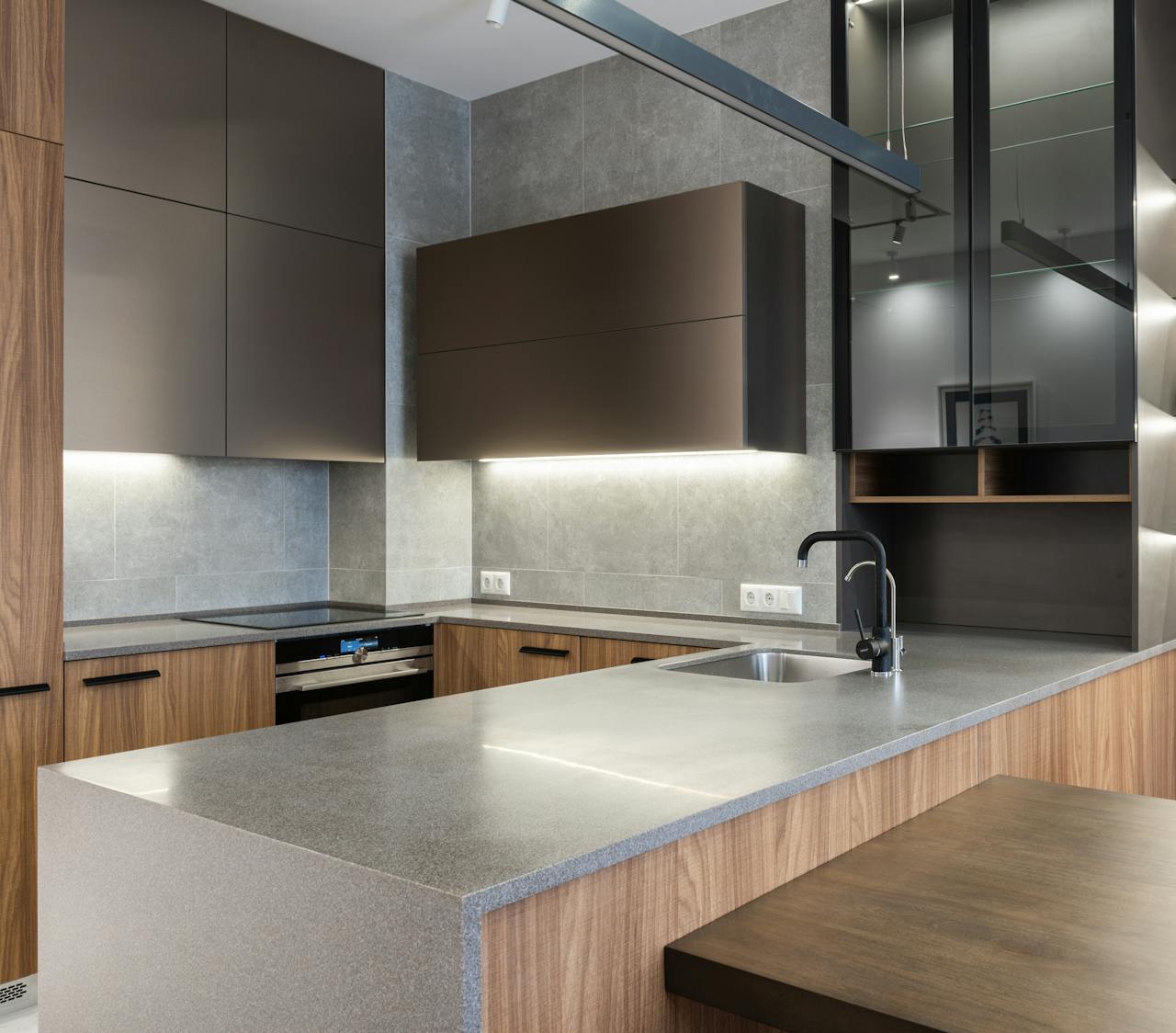
The Colour That Balanced Warm and Cool Tones
The quartz colour I ended up choosing had:
- A soft white base
- Subtle warm-neutral veining
- A balanced undertone that aligned with both my cabinets and floors
It wasn’t stark white.
It wasn’t overly grey.
It wasn’t beige.
It was the perfect harmony between warm and cool — exactly what my Gloucester kitchen needed.
The Colour That Made My Cabinets Look Updated Without Replacing Them
The new countertop colour completely changed how my cabinets looked. The undertone pulled out the best qualities of the finish, making the cabinets seem fresher, brighter, and more modern.
I had originally planned on repainting the cabinets. After installing the countertop, I didn’t need to.
The Colour That Worked With My Future Plans Too
The quartz colour I chose was flexible. It worked with:
- My existing cabinets
- Potential new hardware
- A backsplash I planned to change later
- My light wood floors
- Neutral and bold décor
This meant the countertop wouldn’t limit future upgrades — it would support them.
How the Countertop Colour Transformed My Gloucester Kitchen
It Made the Entire Space Look Brighter and Bigger
The quartz colour reflected light beautifully. Instead of absorbing brightness, it bounced light around the room, making my kitchen feel significantly larger.
The transformation was immediate:
- Shadows disappeared
- Corners felt open
- The room looked airier
- The space felt more welcoming
It was like someone installed a new lighting system — except the countertop alone created the effect.
It Created Visual Harmony Across Cabinets, Walls, and Flooring
The right countertop colour unified the room. Suddenly, all the tones made sense:
- The cabinet colour finally looked intentional
- The wall paint felt perfectly chosen
- The flooring blended seamlessly
- The backsplash no longer felt outdated
Everything flowed effortlessly.
It Made My Quartz Island a Stunning Focal Point
The island became a centerpiece — not because it was huge or dramatically shaped, but because the quartz colour elevated the space around it. The subtle veining carried across the island beautifully, adding elegant movement without overwhelming the kitchen.
The Functional Benefits of Choosing the Right Colour
Better Visibility While Cooking and Prepping
Before, darker surfaces hid crumbs and spills, making cleaning harder.
With the new quartz colour:
- I could see everything clearly
- Prep work felt easier
- Cleaning became quicker
- The surface always looked clean
Better Food Presentation
When hosting, I noticed how food looked more appealing on a lighter quartz surface — especially baking, charcuterie, and plated meals.
A More Peaceful Atmosphere
Colours affect mood.
A balanced, soft quartz tone made the kitchen feel calm rather than busy.
The Mistakes I Avoided While Choosing My Countertop Colour
Here are the pitfalls I sidestepped —
Mistakes I avoided:
- Choosing a trendy colour instead of a timeless one
- Ignoring undertones
- Picking a colour only based on showroom lighting
- Choosing a surface that clashed with my flooring
- Selecting quartz with busy veining that overwhelmed the kitchen
- Forgetting to test samples under nighttime lighting
- Matching countertops and cabinets too closely (which looked flat)
Avoiding these mistakes ensured the final result felt polished and professional.
Why Quartz Was the Perfect Material to Pair With the Right Colour
The Consistency Made Colour Selection Easier
Quartz offers predictable patterns and tones — perfect for getting the exact colour and undertone I needed.
The Polished Finish Enhanced the Colour Even More
The smooth shine amplified the brightness of the chosen tone, enhancing the overall mood of the kitchen.
The Durability Let Me Focus on Beauty Without Sacrificing Function
Quartz allowed me to choose a light tone confidently, without needing to worry about stains, scratches, or discoloration.
Final Thoughts: The Right Countertop Colour Completely Redefined My Kitchen
Choosing the right quartz countertop colour didn’t just upgrade my Gloucester kitchen — it transformed it. The change was immediate, dramatic, and lasting. The space became brighter, more modern, more cohesive, and far more enjoyable to use every day.
This renovation taught me something I never expected:
the colour of your countertop controls the entire design language of your kitchen.
Get it right, and the whole room comes together.
Get it wrong, and nothing feels aligned.
Choosing quartz — and choosing the right colour — was the best design decision I made in my Gloucester kitchen. It’s a choice I would repeat without hesitation and recommend to anyone planning a renovation.